The Jack Henry Rebrand: Redesigning Brand Identity & Collateral


To support our rebrand, identity elements and collateral were developed to evolve the Jack Henry™ look and feel while further developing and differentiating the brand personality and characteristics.
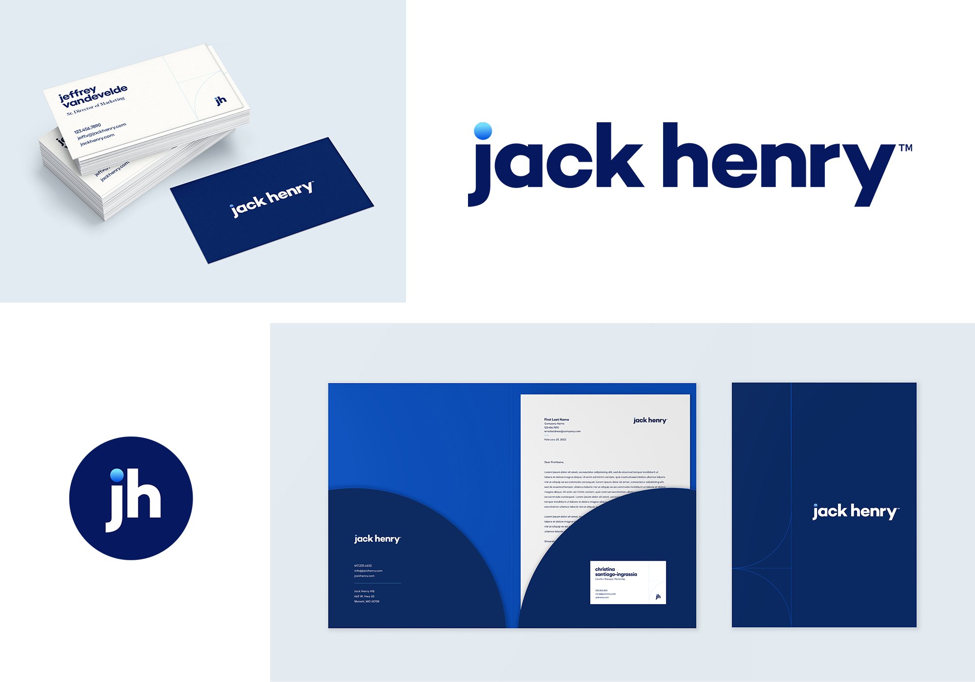
The New Logo
Sarah Henderson, an in-house Creative team member and Advisory Copywriter at Jack Henry, crafted an excellent summation of the story behind the new logo. I’ll share it here as it represents the fusion our brand, modernized, with the company’s history and foundational values.
At Jack Henry, we’re dedicated to our Associates, our clients, and the communities we serve. This has been true since Jack Henry and Jerry Hall founded our great company more than 45 years ago – and it always will be.
To respect our roots while looking forward to the future, our reimagined logo is not a revolution, but an evolution. A next step. A way forward as we continue to emerge as one well-rounded financial technology company.
That’s why the new logo keeps the all lowercase “jack henry,” navy color, and Sans Serif font from the original – while updating it to be more open, bold, modern, and clean. The key element that makes this logo unique is the dot over the “j,” which symbolizes our well- rounded ecosystem of diverse ideas, thoughts, capabilities, and experiences collaborating to create new connections.
This is how we honor our rich history. This is how we evolve and build on our heritage with innovation and purpose.
The Jack Henry logo is truly a cornerstone in the branding and visual identity for the company. Our logo exploration and development resulted in our primary Jack Henry word mark as well as a monogram version of the logo with the lowercase “jh” and keeping the gradient dot over the lowercase “j”. The monogram version of the logo allows us to include this important brand element in placements where our word mark would not be legible such as small banners, icons, or social media profile imagery. The monogram can also be used as a secondary logo element in placement, where our word mark is used first and more prominently, such as multipage collateral or social media videos.
Colors
Our color palette is one of our most important brand elements. Color provides an opportunity to further create an ownable and consistent styling to the company’s many collateral items and tactics. The anchor of the Jack Henry palette is Heritage Navy. As our hero color, this classic navy blue is an evolution of the original Jack Henry brand color, now updated in tone for better usability and harmony with the other brand colors: Vibrant Cobalt, Tech Blue, Open Sky, and Warm Ivory.
We also feature a special gradient that we call our Financial Freedom gradient made with the Vibrant Cobalt and Tech Blue.
This brand palette represents trust, strength, and intelligence as it also reinforces brand recognition across all of touch points across Jack Henry’s many audiences.
Typography
The approach we've taken with our brand fonts places our personality and characteristics front and center. Using the geometric sans serif Gellix as our primary typeface creates a look and feel that is approachable, easy to understand, modern, and bold. To support Gellix, we use Financier Display as our secondary typeface. Used for subheadings and other secondary typography elements, Financier Display is a classically styled serif font that is both modernized and elegant to add a touch of formality to the brand while still remaining approachable and honest. Another element of our typography strategy includes lowercase letters in our headlines. The exception to the lowercase treatment includes any proper nouns, such as cities, states, company names, etc. This approach provides a unique way of presenting big ideas while also visually connecting with our logo and creating a modern, human-centric vibe.
Identity Materials & Collateral
The identity materials were also developed around our new branding and included business cards, letterhead, folders, corporate presentation templates, and document templates among other items. Having a beautifully designed suite of branded identity materials allows for greater cohesive presentation companywide, and also goes a long way towards inspiring pride in our associates around our rebrand efforts and image.
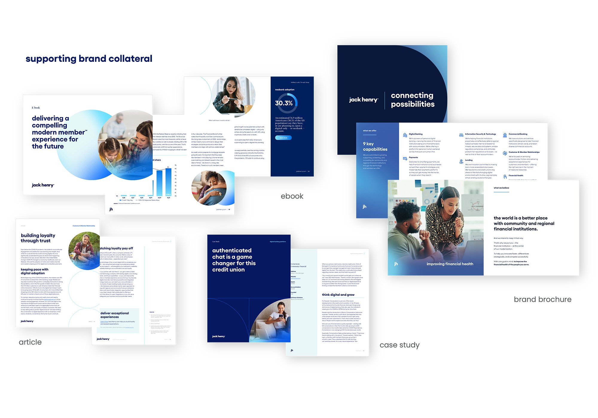
Well-designed branded collateral is vital for any B2B organization and was a major priority for our Creative team in preparing for the rebrand launch. Creating marketing collateral templates in our new look and feel with content and the buyer journey in mind was vital to the process of getting the company and our promotional materials. This included new designs for templated items such as articles, case studies, product briefs, and more. This creative effort also included developing unique layout approaches for thought-leadership materials, such as e-books, brand brochures, and infographics.
The Creative team used the Jack Henry brand elements in a clean, modern approach – applying brand colors, with circular line elements and consistent, outlined icon styling in visually impactful layouts. Photography used throughout our collateral is candid and people-centric featuring diverse subjects in environments that are not overly staged, but instead, are warm, inviting, and authentic. Images are also selected with interesting pops of color in mind, whether it be in the subjects’ clothing or the environment in which the photograph is set. This provides an appealing visual contrast when our gradient overlay is applied to the edge of an image as part of our brand photography treatment.
On the copywriting side, our collateral development involved implementing our updated brand voice in across all of our launch day collateral. The Jack Henry brand voice is conversational, presents Jack Henry as an advocate for our audiences, and embraces six foundational characteristics: confident, empowering, accessible, empathetic, genuine, and dynamic.